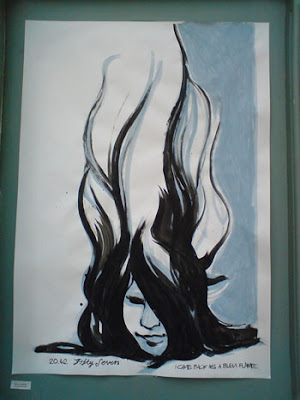
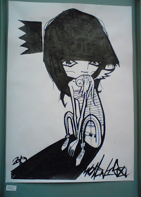
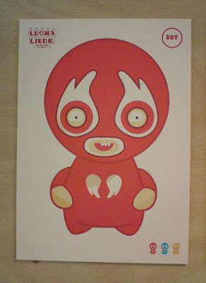
Leeds Alternative Comics Fair

We had a real treat in store for us yesterday: the Leeds Alternative Comics Fair! We both eagerly headed over to A Nation of Shopkeepers in Leeds to see what delights were on offer.

Image © Steve Tillotson

There were a few familiar faces including our friend Fon Ma a.k.a. The Pern (who taught us some kick ass self-defence moves last year), Hugh ‘Shug’ Raine the mastermind behind Reet Comic (we have stacks of those on our bookshelf) and Kristyna Baczynski whose blog we’ve been reading for years after spotting her work at the Northern Design Competition years ago.

It was a great afternoon out and a real contrast to the gloomy weather too. We even grabbed ourselves a copy of Kristyna’s comic, ‘Ladder‘ 😀

Ready Or Not Here We Come

This year’s Graphic Design degree show ‘Ready Or Not Here We Come‘ at Leeds College of Art wasn’t to be missed and so we both dashed from one display to the next grabbing business cards and taking photos. We’re always pleased to see such creativity and come away feeling inspired.

What was really interesting for us was the hand-drawn element we found recurring in several graduating student’s work. We both seem to gravitate towards the more illustrative design work when we attend shows like this. It adds a touch of magic to a design and gives you a hint at the personality behind the work.
Here’s the snaps we took this year as we buzzed around from one honey pot to the next:
Image © Chris Matthews www.immunityfromdestruction.com

Image © Charlotte Riley www.helloimcharlotte.com

Image © Nichola Tiffany www.nicholatiffany.co.uk

Image © Mille Haugnaess http://millehaugnaess.co.uk/

Image © Ollie Saward www.olliesaward.co.uk

Image © Leigh Wortley www.leighwortley.co.uk

Image © Jonny Packham www.jonnypackham.co.uk

Read our blog posts from previous year’s degree shows here:
http://koojicreative.blogspot.com/search/label/EndofYearShow

For more tasty morsels of inspiration:
Check out our bookmarks of links found on business cards from the degree show: http://www.delicious.com/KoojiCreative/EndofYearShow+2011

Graduate shows – What is the point?
Target Print is a Leeds based digital and litho printer. It’s owner, Peter Biggins, wrote a blog post about his experiences at this year’s shows. Read it here: http://leedsprinter.blogspot.com/

CF Studio Launch and The Blank Showcase

Amy and Bek A.K.A Lord Whitney invited us both to attend the launch of CF Studios, their new collaborative workspace and the exhibition ‘The Blank Showcase’. They asked their guests to bring along items in response to the initials CF and the collected or created pieces were then added to the exhibition wall.

Here are a few photos from the evening:

 Here’s some amusing wordplay from Johnny

 and here’s Katherine’s feathery fancy

…and here was our submission: Crappy Film (Plan 9 from Outer Space directed by Ed Wood)

It was great to see the creative duo in action once more and to check out their fun social experiment. The pieces on display were really quirky and imaginative and we look forward to seeing what they come up with next!

Visit Lord Whitney here: www.lordwhitney.co.uk
Find out more about the studio: www.cfstudios.co.uk

Target Print

It’s not often you get the opportunity to fully appreciate the work involved for those you might deal with on a daily basis. For me, getting a chance to take a look around a local printer’s workshop and better understand their side of things in the whole creative production process, was too good to pass up! I met a great guy at last night’s Creative Networks: Peter Biggins, the owner of Target Print, a Leeds based digital and litho printer. As we were chatting, it slowly dawned on me that I should probably ask if I could come visit his print workshop (as I’d always intended to do that at some point, as part of my ongoing learning) and Peter kindly agreed.

This was as great a time as any to swot up on my print knowledge and so I headed out today eager to learn! Peter spent the best part of the morning (and into the early afternoon too!) showing me around his workshop. It was a real eye-opener to see the scale of the printing presses and machinery that printers use.


Peter even took the time to explain Lithography and Offset Lithographic Printing to me. To see the lithographic printing process in action was incredible! Sheet-fed presses chugging away, tubs of Pantone process colour inks, Font Furniture – it was all just fantastic!


Huge Heidelberg presses churning out thousands upon thousands of prints!


We know it as CMYK (Cyan, Magenta, Yellow and Black) but did you realise that it’s printed in this order: Black, Cyan, Magenta and Yellow? The darkest ink, black, goes on first (although this used to be the last to go on years ago!)

The inks come in large pots

All the colours of the rainbow!


I never considered that some inks took time to dry (although now it seems obvious) or that printer’s often work night shifts to get a print run completed! I think many people just don’t realise what it takes to print their work and expect instant results.

How do they achieve that perfect alignment every time you ask? With Lays! (Read the print terminology below)

Spray powder (starch) is applied to help separate the sheets

The console desk – check out all the buttons! :O

…and here’s where all the prints come out

All the off cuts are taken away and pulped down for recycling. How eco-friendly!

Heidelberg Cylinder

Font Furniture!

Forme Cutting

Shelves packed with Formes

Heidelberg Cylinder

Heidelberg Platen

…and here’s how they do all those Z-Folds! (and to think, I used to believe it was all done by hand, yup)

I asked what problems they encountered the most from Graphic Designers when they send their files in for print and I was a bit shocked to hear that designs with no bleed area was a common one. Files being sent over as RGB instead of CMYK was another! I’ve been reading up on colour workspaces/ colour calibration so as to avoid unrealistic expectations when you send your work to print (and that of your client when they look at your beautifully designed PDF on their RGB monitors) so I was really surprised by that one. I know there’s still much to learn but if I can steer clear of these obviously amateurish mistakes I think I’ll be well on track 🙂

Understanding the history behind our craft (and it is a craft, no matter how much it evolves over time) really helps me to appreciate our beginnings. I can see how Graphic Design has changed with the introduction of the Macintosh computer and I can see how the Print Industry has gone from Letterpress to Lithographics, Repro and Digital (and much, much more!). So, it’s good to know that there are still those out there who care deeply about their craft. I will continue to care deeply about mine.

Many thanks again to Peter Biggins and his team from Target Print for spending so much time showing me around and answering my questions!

Target Print Leeds Ltd… …print that targets your needs

Target Print is a Leeds based digital and litho printer producing a wide range of work including flyers, company brochures, stationery, folders, posters, leaflets and much more.

To find out more visit their website here: www.targetprint.co.uk

If all that wasn’t enough for you have a read through this handy, nifty list of Print Terminology that’ll have all your peers pantone green with envy!

Work-and-Turn and Work-and-Tumble
“Sheetwise, work-and-turn, and work-and tumble sound like just so much gibberish, but grasping their meaning can save you money buying printing”. Read more here:
http://www.printindustry.com/Newsletters/Newsletter-45.aspx

Dot Gain
“Dot gain (also known as Tonal Value Increase) is a phenomenon in offset lithography and some other forms of printing which causes printed material to look darker than intended. It is caused by halftone dots growing in area between the original printing film and the final printed result. In practice, this means that an image that has not been adjusted to account for dot gain will appear too dark when it is printed”. Read more here: http://en.wikipedia.org/wiki/Dot_gain

NB: Avoid serif fonts at small point sizes, or pinch and swell type (e.g. the Loki Cola typeface) when using reverse type (e.g. white type on a black background) as you run the risk of the copy becoming unreadable. It might look sharp on screen but the ink may spread!

Lay Edges
“The two edges of a sheet which are placed flush with the side and front lays on a printing machine when feeding”. Read more here: http://www.twpg.com.au/Retail/glossary.htm

Lay Mark
“An area of ink on the edge of a sheet to make the lay corner easily identifiable. It appears on the side lay edge and is closer to the gripper edge than the trailing edge”. Read more here: http://www.twpg.com.au/Retail/glossary.htm

UV (Spot) Varnish
A varnish applied after printing, either as an overall finish to give a high gloss finish, or applied as a ‘spot’ varnish to certain previously printed images, then cured using ultra violet light. Read more here: http://www.encyclo.co.uk/define/UV%20varnish

NB: Ultraviolet Inks – Set instantly, by light! Read more about UV inks and Flexographic printing here: http://www.flexoexchange.com/gorilla/uvink1.html
or check out this useful tutorial from Computer Arts Magazine about using spot colours and varnishes here.

Forme Cutting
“A process of bending a knife’s edge to the desired shape and punching out the form in the required material – just like a cookie cutter”. Read more here: http://www.conceptforum.com.au/formeCutting.php

Die Cutting
“A “forme” or “die” is pressed onto a flat material to cut, score, punch and otherwise shape the material”. Read more here: http://en.wikipedia.org/wiki/List_of_industrial_processes

Letterpress
“Letterpress printing is relief printing of text and image using a press with a “type-high bed” printing press and movable type, in which a reversed, raised surface is inked and then pressed into a sheet of paper to obtain a positive right-reading image”. Read more here: http://en.wikipedia.org/wiki/Letterpress_printing

Lizzie Mary Cullen: Off the Wall!

What a great talk we went to tonight at Creative Networks and this time it wasn’t from someone who has been in the industry for many years, it was by an emerging star, Lizzie Mary Cullen. Lizzie is a multi award-winning designer specialising in illustration and graphic design and was described as one of the industry’s ‘leading lights’ by Design Week. Her work has a real Mucha-esque feel to it which we really love especially when it’s carried off as well as this!

Image ‘Specials’ © Lizzie Mary Cullan

Lizzie’s First Solo Show at Artefact at the Framers Gallery
All proceeds went to the Big Issue Foundation. Dan Radcliffe (of Harry Potter fame) and John Bird (founder of The Big Issue) were there to show their support. Be sure to check out her joke at 1:14 – it’ll have ya in stitches 😀


Merry Doodle: 2010 – Blue Hive Agency Christmas Card

Blue Hive needed an Xmas card to generate buzz for their new agency. Lizzie filled a 12m x 3m ‘Doodle Wall’ in their office with tweeted messages all live on webcam. All this was uploaded to Flickr and in just 3 days they “received thousands of tweets, logged over 2,800 live viewer hours and saw a 632% increase in traffic” to their website. Amazing!

Lizzie drawing for Zizzi, Covent Garden
This stop motion creation of ‘Bow Street Zizzi’ was filmed over three days. What a beautiful large-scale mural and absolutely stunning to see it being produced start to finish.
We’ve both been really inspired and it definitely goes to show that you can learn from creative people at every stage in their career, not just the well seasoned professionals (although there’s plenty to learn from them too!) A really entertaining night, packed full of funny anecdotes and giggles. Thanks Lizzie!

To see more of Lizzie’s work visit her website here:
www.lizziemarycullen.com

Or, if you’re into bird seed follow her tweets on twitter:

Feeling Light Headed?

The Light Shopping Centre held a competition recently to design a re-usable shopping bag. My design on a cool fabric bag!? How could I resist?

The winning entry will be launched at the ‘Leeds Loves Shopping’ event next month and the winner will also receive £200 to spend in The Light! (This year’s Christmas pressies are riding on my getting this!!) It’s for a good cause too as all proceeds from the sales will be used to help feed the animals at Meanwood Valley Urban Farm.

So without further ado here’s my submission!

‘Feeling Light Headed?’ © Katherine Moss

‘Feeling Light Headed?’ © Katherine Moss

Shopping at The Light always makes me feel giddy and light headed. I wanted my design to capture this with a girl’s swirly hair floating off in all directions, busying about her head as she dashes from shop to shop!

Voting is open until the end of this month so if you’re passing through the centre take a look. It’s up on display opposite Body Shop 🙂

Art in Unusual Spaces

We headed over to the Corn Exchange in Leeds this weekend after hearing about a cool new arty happening called Art in Unusual Spaces – ‘A series of visual art exhibitions, installations and curiosities in shop units and across Leeds city centre.‘ We eagerly looked around the results of Drawing Time! an hour long drawing extravaganza involving 46 artists. Each artist had a set amount of time to produce their drawing depending upon their position on the circular balcony on the first floor.

Here are a few of the drawings that really took our fancy:

Image © Kristyna Baczynsk

Image © Drew Millward

Image © Helen Harrop (we collaborated with Helen on this Travelling Moleskine)

Image © Oliver Redding

Image © John Chamberlain (check out John’s blog here)

Image © Neil “Women 158” Parkinson

Image © The Pern

Image © Richard Shields

Image © Curse273

Image © Jordan Ramoth

Image © Graham Pilling

We think this is a brilliant idea, using empty shop spaces in this way, and will definitely be on the look out for other events!

‘Art in Unusual Spaces is a scheme which endeavours to open up empty shop spaces in Leeds City Centre.’

Check out the website here

Brand New Talent

It’s here again! As unbelievable as it may seem it’s been a year since Leeds College of Art’s last End of Year Show. This year’s exhibition entitled ‘Brand New Talent’ was full to the brim with creative work from the newest crop of graduating students.


Out of all the creative degree shows Leeds College of Art’s are our favourite. We’ve never been disappointed in the standard of work on display and there’s always sure to be a select few that really stand out. It’s a chance for us to see what’s new, which trends are trending (or being over-trended!) and who are the new kids on the block.

Johnny perusing a portfolio 😀

Here’s a selection of pics from the BA (Hons) Graphic Design course that caught our eye:

Image © Nick Birch

Image © Nick Birch

Image © Rob Cope

Image © Rob Cope

Image © Gemma Grainger

Image © Claire Nicholson

Image © Dean Gray

Image © Dean Gray

Image © Olivia Greaves

Image © Kate Prior

Image © Kate Prior

Image © Kate Prior

Image © Kate Prior

Image © Sam Putera

Sculpture © Jennifer Burton

This little fella escaped from the Fine Art department!

Portfolio Websites: A collection of links found on business cards from the show:

Sara Yates
Hayley Kavanagh
Lucy Hawkins
an& design
Adam Sneade

and if those aren’t enough we’ve bookmarked a whole bunch here